Analyzing Maps
Tuesday, July 24, 2012
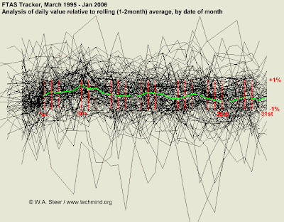
Index Value Plot
https://blogger.googleusercontent.com/img/b/R29vZ2xl/AVvXsEj64bvxEjG9tVIReDqm2Eugx_M8FR6tiG-Aw1Oa4UWaG22ACCSdMcaGK-qUlad4Xe1dPvcb6VWxivTzDRovgmdP7b-lc_kVe8id9HuFy6ad0cwleDR-z3L0Rt_Ipzv2V31nyY2O_fOxEHY/s400/ftas_value_by_date.gif
A visualization map that using an index value instead of an absolute value. I chose this example because it shows just how interesting how visual maps can be.
No comments:
Post a Comment
Newer Post
Older Post
Home
Subscribe to:
Post Comments (Atom)
No comments:
Post a Comment