This is a map that was two dimensional but now has been turned into three dimensional. The colors and box size have turned this map above into a 3d image.
Tuesday, July 24, 2012
UV Map
This is a map that was two dimensional but now has been turned into three dimensional. The colors and box size have turned this map above into a 3d image.
STAR PLOT
Used to examine relative values for a single variable but also to locate other similar points. Star plots can be restricted to how much data is allowed to be compared which can fine tune results. The above star plot is showing automotive designs but it is broken down into 6 different categories and only 4 designs are compared which allows the results to be more relative to what you are looking for.
Stem and Leaf Plot
Helps visually present quantitative data. Similar to a histogram but usually keep the original numbers down to at least two significant figures so the data set is more accurate.
Box Plot
A map that is an easy way to depict numerical information. This is also called a box and whisker plot.
Histogram
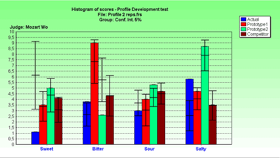
A graphical, visual expression of distribution data. Histograms are used to plot the density of data. This example shows the distribution data of individual test scores.
Parallel Coordinate Graph

A map used to make a high dimension graph into an easy to ready format by combining parallel points and variables. Color is also used to make the map more appealing to the naked eye.
Triangular Plot

Map that graphically depicts the ratio of three variables in the form of diagram. Used commonly to compare items of similar interest or cycle through one another.
Subscribe to:
Posts (Atom)