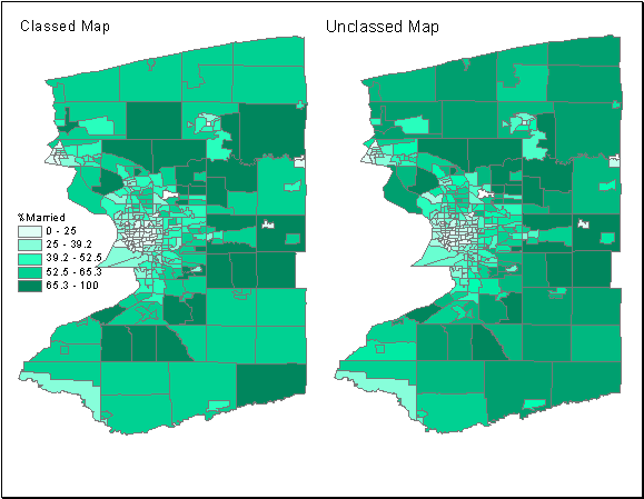
This is a map that was two dimensional but now has been turned into three dimensional. The colors and box size have turned this map above into a 3d image.
Tuesday, July 24, 2012
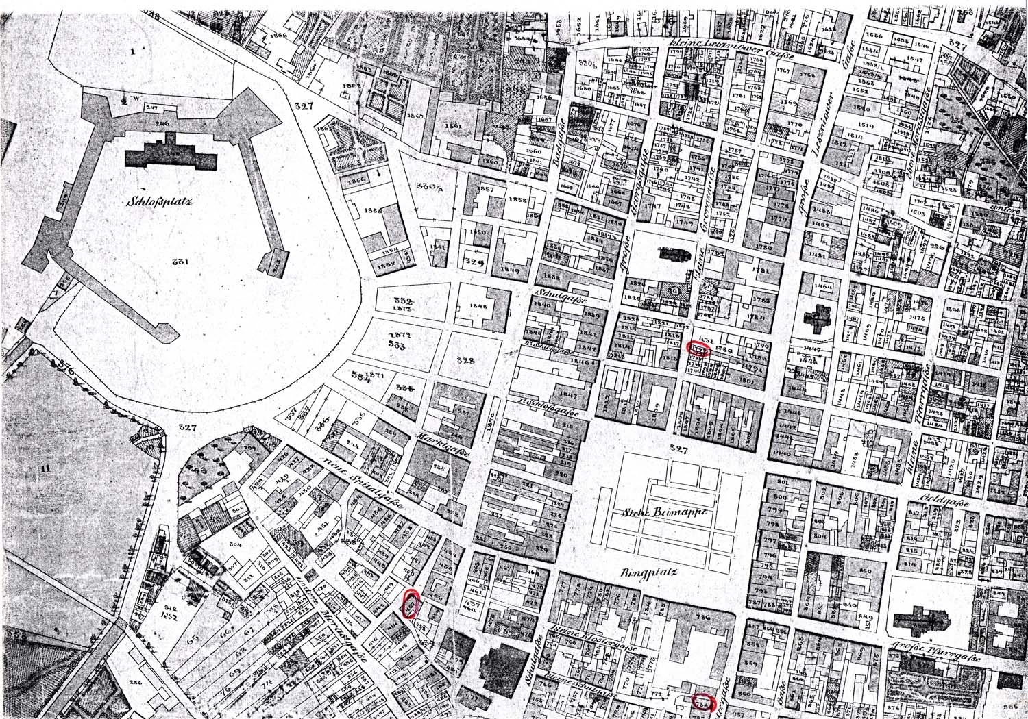
UV Map
This is a map that was two dimensional but now has been turned into three dimensional. The colors and box size have turned this map above into a 3d image.
STAR PLOT
Used to examine relative values for a single variable but also to locate other similar points. Star plots can be restricted to how much data is allowed to be compared which can fine tune results. The above star plot is showing automotive designs but it is broken down into 6 different categories and only 4 designs are compared which allows the results to be more relative to what you are looking for.
Stem and Leaf Plot
Helps visually present quantitative data. Similar to a histogram but usually keep the original numbers down to at least two significant figures so the data set is more accurate.
Box Plot
A map that is an easy way to depict numerical information. This is also called a box and whisker plot.
Histogram
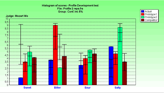
A graphical, visual expression of distribution data. Histograms are used to plot the density of data. This example shows the distribution data of individual test scores.
Parallel Coordinate Graph

A map used to make a high dimension graph into an easy to ready format by combining parallel points and variables. Color is also used to make the map more appealing to the naked eye.
Triangular Plot

Map that graphically depicts the ratio of three variables in the form of diagram. Used commonly to compare items of similar interest or cycle through one another.
Windrose Map
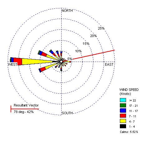
A map diagram that summarizes information about wind characteristics in a certain location in a specific time frame.The windrose above describes wind speed for Washington at 78 degrees.
Climograph

Map used to show average temperature and precipitation of an area. Scientist use these graphs a lot to determine weather patterns and climate changes. The example above is interesting as it incorporates a thematic map of Brazil in the background of the climograph for Brazil.
Population Profile Map

Map that shows the population growth patterns of a particular area. Data for this map is usually gathered via a survey. This example show the population profiled data gathered from poor countries in the year 2000.
Scatter Plot

This is a mathematical diagram that shows the coordinates of two values. Used commonly to represent math problems and equations.
Index Value Plot
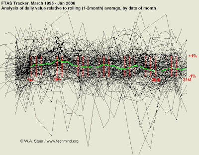
A visualization map that using an index value instead of an absolute value. I chose this example because it shows just how interesting how visual maps can be.
Lorenz Curve

A graphical representation of a cumulative distribution function.Useful for expressing inequality in individuals.
Bilateral Graph Map

A map that shows positive and negative values of a data set in the form of a graph. This allows you to easily see the results of a data set without having to compare it to another map. This example is really interesting as it shows positive and negative values of suicide rate.
Nominal Area Choropleth Map
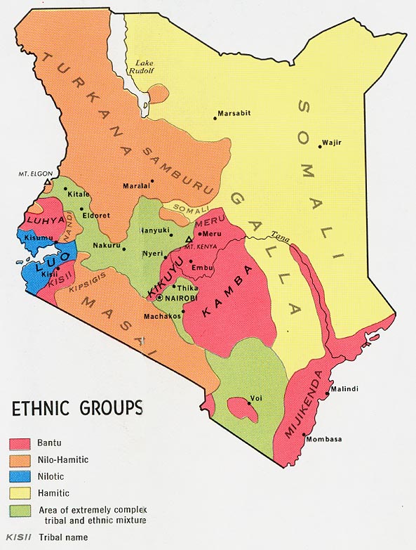
This kind of Choropleth map is used to show qualitative data that are categorized without any implicit ordering. This example shows the ethnic groups of a country with nominal groups.
Unstandardized Choropleth Map

This thematic maps displays the data as raw numbers in this choropleth map. The data has not been really averaged as show in this map of Australia.
Standardized Choropleth Map

This kind of choropleth map has a standardized view such as a visible variable of value. This map of Canada shows a standard variable of age.
Univariate choropleth map

This choropleth map shows only one variable data set versus the bivariate choropleth map which shows two variables. This example shows one single variable for poverty in United States.
Bivariate choropleth maps

A choropleth map with two variables. Displays two separate variables simultaneously. The example shows the crime rates and murder rates of the same country at the same time.
Unclassed Choropleth map
This map is the same as a classed choropleth map except that this one does not show statistical value. There is now reference or key to specific measures or distances. The example above shows the difference between the two.
Classed Choropleth map

Map using statistical data over previously defined regions. Areas are shaded or colored in accordance to data as well.
Range graded proportional circle map
This map is similar to other proportional circle maps. The only major difference is that the size gradient of each circle is limited to a set range size. The map above shows only a limited range of data based on circle size.
Continuously Proportional Circle Map

This is a proportional circle map that utilizes circle to create point data. The circles are proportional to the variables measured and scale is correspondent with data as well. The above example shows the number of people killed in road accidents and represents the area of extent through the size of the orange circles.
DOQQ Map
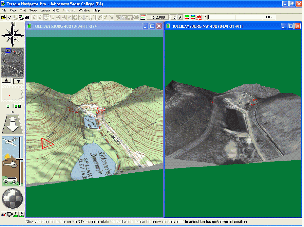
A digital raster image of an aerial photo where displacements and terrain have been removed. It combines the qualities of a picture with a map to increase its quality and results. Serves as a backdrop for vector data. The example above shows how the map would look without the aerial photo incorporated and then the second picture show the map and photo blended which gives a more realistic view of the area.
DEM map

A map called a digital elevation model that uses only height information to develop map. Helps researchers find areas of great depth or areas to avoid. It allows you to see the type of terrain of an area and what the substrate is composed of.
DLG Map

This type of map is also from a geological survey map which is called a digital line graph. This includes areas of transportation, hydrography and public land boundaries. This DLG map above shows roadways over lined in blue around the surrounding areas.
DRG Map
A digital raster graph is a scanned copy of a topographic map which is very common when viewing Geological survey topographic maps online. These maps should be used only for technical and historical use only.
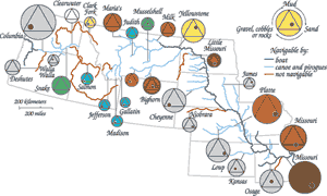
Isopleth Map
This map uses contour lines as well but this kind of map uses the contour lines to show equal numerical values but usually in terms of population or geographic area. The example shown is using contour lines to represent the amount of gravel sized detritus in an area. Contour lines can be used for several different map types so it is important to know what kind of map you are looking at before observing as to not confuse them.
Isopach Map

This map uses a measure of thickness variation, which is used to find oil and underground structural analysis. Maps use contour lines to measure thickness and variation of depth. This is a great example of this kind of map as it shows how the contour lines are depicted underground by using a negative scale to represent under ground level.
Isohyets Map

This map type is also similar to Isobar except this kind is the measure of equivalent rainfall in an area. The map above shows the areas where rainfall is equivalent.
Isotachs Map

Map displaying areas where equal currents of wind speed have been measured. They are in reference to Isobars but instead of equal pressure it is the measure of equal wind speed. This example shows a tropical storm developing by measuring the similar wind speeds in the area.
Isobar Map

Maps that show equal lines of atmospheric pressure typically used in weather broadcast to depict high and low pressure systems. The image above is an example of a typical high and low pressure system with isobars surrounding them.
Lidar Mapping

This mapping technique is used for surveying and scanning large areas or bodies of water. Device is usually attached to aircraft or satellites to depict images of the earth to be displayed in the form of a map. Instruments use ultraviolet, visible and infrared light to capture images to be portrayed on map. Sometimes called "laser radar", but does not actually use lasers or microwaves so therefore this nickname is invalid.
Doppler Radar Map
A map displaying the shift in velocity of a moving object by tracking radar movement with Doppler radar. Used commonly with association to weather forecast and weather broadcast stations. Helps predict the weather, but not always accurate.
Black and White Aerial Photography Map

This kind of map is a form of remote sensing seen from the naked eye in a black and white version. These types of maps where useful in the 1930's when color photography was still underway. The map above is a picture of a highway in black and white which we usually do not see anymore.
Infrared Aerial Photo

These maps are very useful for the everyday users as well as for cartographers as they depict the image of the surroundings from a higher elevation via a plane or helicopter and in the old days they would use balloons. These cameras used allow the infrared part of the image to be captured which allows layers of the image to be document and sorted through. Google maps uses these maps to help with driving directions and as well as observing certain locations via computer.
Cartographic Animation Map

This type of mapping is using several maps or predictions and turning them into one map by using animations to show movement and past, present and future prediction of the outcomes of the world or events. These maps have become very popular over the years as they show a lot of information in a short amount of time but basic enough to comprehend it.
Cartogram Map

This map type is a thematic map that has a variable that substitutes land area and distance. As you can see in this example, there are street names and address instead of roads or measured distance.
Flow Map

These types of map show movement from one location to the next. This is also called a flow chart, process flow map and functional process chart. In this example we can see that the headquarters for satellite offices starts on the West coast of the country and then flows to 4 other locations on the east coast.
Isoline Map

This map has continuous lines that join points of the same value to represent data. In this case, The lines and shades of color are combined to show the high and low pressure systems building and moving across the country.
Proportional Circle Map

The area of the circles in these maps is porportional to the value of the data set represented. The map above shows how urban population would look like in regards to a proportional circle set.
Chloropleth map

This kind of map uses differences in shading and color coordination to represent differences in quantity or volume of an area. The example used above shows that the different colors correspond to the amount of people occupying the world. Red being the most dense and purple being the least or no population.
Dot Distribution Map

A map used to represent spatial data. Most common types are population maps with the data points represented by dots or shaded circles. The map above uses the dot symbol and color types to show the species population of a type of bacteria found on the West coast of the United States.
Propoganda map

This type of map is used to give off a political message in the view of a map. It shows the view of the cartographer and how he depicts the political message being provoked. The map above shows how Ronald Reagan view some parts of the world.
Hypsometric map

A hypsometric map is very similar to a topographic map as it uses contour lines to describe elevation and distance. The difference between the two is that hypsometric maps use color to distinguish different land forms and elevation as well as contour lines. I chose the map above to show how the drastic color transition from land to see makes the map stand out better and allows you to see where the high and low points of elevation are without actually having to look at the contour lines.
PLSS Map

A public land survey system map is a technique used to survey and identify land parcels in the United States. This map is different then and coordinate system map as it is more detailed and not used worldwide. The map above in my opinion is a hybrid of a PLSS and a topographic map has grids to show land parcels for a PLSS but also the lines represent distance and bend to create a three dimensional side of the map like a topographic map.
Monday, July 23, 2012
Cadastral map
Thematic map

These maps can have "physical, social, political, cultural, economic, sociological, agricultural, or any other aspects of a city, state, region, nation, or continent".[1] There are a lot of these maps on the internet but I think the map above is a good example as it shows the physical geography and a technique called proportional symbolizing that shows the maritime zones of Australia.
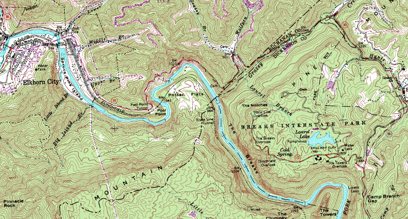
Topographic map

This type of map uses contour lines to representation elevation of an area while giving the map a three dimensional look. Although only lines, this map is easy to read and can help a person to determine how rugged, hilly, or smooth an area is.
Planimetric Map

This is a map that only uses horizontal positions without topographic details. Examples of these entities would be roads, bridges, buildings and sidewalks. The map above shows a good representation of horizontal positions in Tampa by using lots of skyscrapers and roads to highlight the downtown area of the city.
Subscribe to:
Posts (Atom)